Prototype Testing in Qatalyst
Qatalyst offers a test block feature that allows users to conduct prototype testing. It is a type of testing that involves evaluating a preliminary version of a product to identify design flaws and gather feedback from users or stakeholders. You can upload a prototype of your website or mobile app, define the flow of the design and test it on respondents and gather responses.
Prerequisite for prototype link
- The file has to be publicly accessible.
- The file has to be from the services we support, "Figma" and "Sketch", for now. (We will be adding more in future)
- The file should have at least two screens.
- Ensure the prototype nodes are connected, and there is a clear starting node with no independent nodes or all the nodes are connected.
Steps for adding prototypes:
- Access your recent Figma projects by visiting https://www.figma.com/files/recent. This page will display a list of your Figma projects.
- Choose the specific project you want to test with Qatalyst.
- To open the prototype, simply click on the play button ▶️ located in the top menu.
- In the top menu, locate and click the "Share Prototype" option. This will generate a shared URL for your prototype.
- Qatalyst is compatible with all types of prototypes, including those designed for desktop, mobile, and tablet devices.
- Ensure the Link Sharing Settings are set to "Anyone with the link can view." It is important for your Figma prototype to be publicly accessible in order to import it successfully.
- Once you have set the sharing settings, click on the "copy link" button. Then, simply paste the copied link into Qatalyst for seamless integration.
Journey Paths
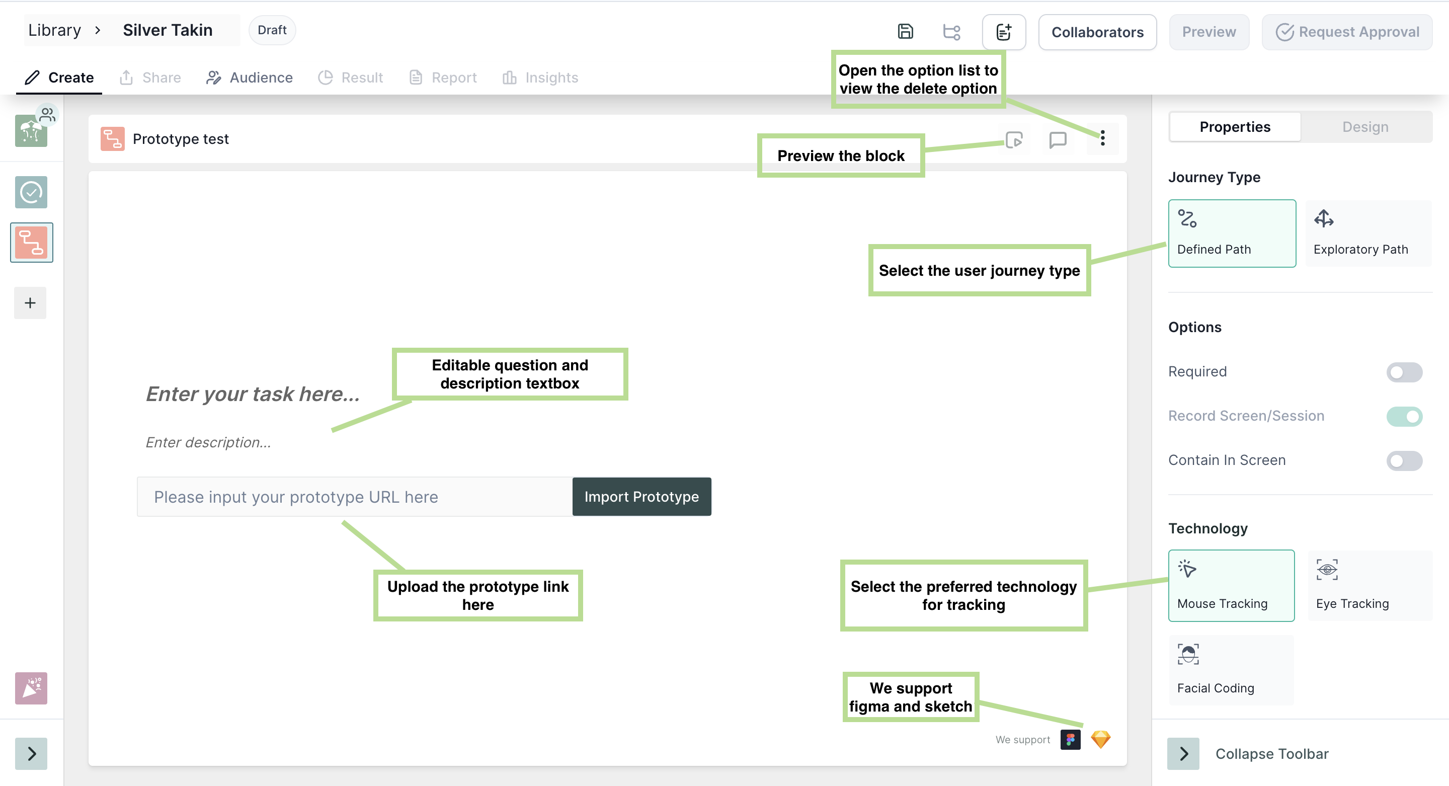
- Defined Path: A defined path is a predetermined sequence of steps or actions that a user can follow to complete a specific task or goal within the prototype. However, Qatalyst allows you to define multiple paths for the different screens. The start screen will be the same, and the user can change the end screen of the test. In between the end and start screen user can define multiple paths.
- Exploratory Path: In this path type, while creating the research, the user can define the start and end screen, and while taking the test, the respondents navigate from different screens to reach the endpoint. Using this technique, you can identify if participants can finish an activity effectively, the time needed to accomplish a task, and adjustments necessary to increase user performance and happiness and examine the performance to determine if it satisfies your usability goal.
When to use which journey Path?
Defined Path: If you have pre-determined navigation paths for your prototype, using a defined path allows you to assess which path is most convenient or preferred by users. This helps you understand which specific path users tend to choose among the available options.
Exploratory Path: Choose an exploratory path when you want to test whether the respondents are able to navigate between the screens and are able to complete the given task and gather information about users' natural behaviour and preferences. This approach encourages users to freely explore the prototype and interact with it based on their own instincts and preferences. It can reveal unexpected insights and usage patterns that may not have been accounted for in predefined paths.
Properties
- Required: Taking this test is mandatory; the respondent will not be able to move to another question without taking this test.
- Randomize: The image options will appear in random order.
- Screen Recording: Using this option, the whole session of taking the test will be recorded along with the audio.
Technology
- Mouse Tracking: Mouse tracking is a technology that records the movement of the user's cursor on the screen as they interact with the design. This technology can provide insights into how users navigate through the design.
- Eye tracking: Eye tracking is a technology that records the movement of the user's eyes as they interact with the design. This technology can provide insights into which elements of the design users are looking for, which areas are most engaging, and which areas may need improvement.
- Facial Coding: Facial coding is a technology that is used to analyze users' facial expressions as they interact with the design. This technology can provide insights into users' emotional responses to the product. It can be used to optimize the product's design and messaging to elicit more positive emotional responses from users.
To select the technologies, click on the boxes.
You can select more than one tracking technology at once too.
Result View 📊
Once the respondents have taken the test, you will be able to see the analytics in the result section.
1. Blocks Summary
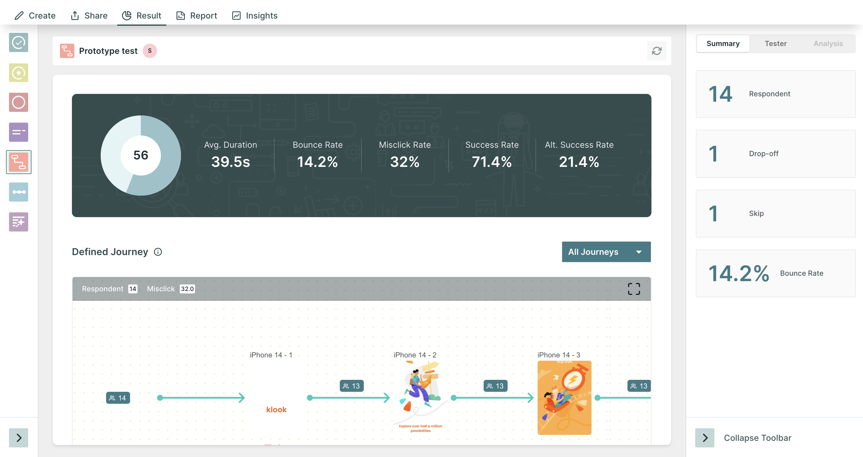
In the summary section, you will find the following information:
- Respondents: Number of people who initiated the test block.
- Skip the Number of people who choose to skip the block.
- Drop-off: Number of people who have not moved on to the next block.
- Bounce Rate: ((Dropoff + Skip)/ Number of Responses)*100 . (In Percentage)
2. Task Summary
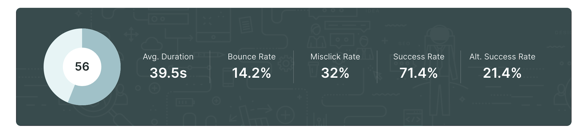
In the dashboard of the result, you will find the summary of the test and the following information:
- Average Duration: The average time respondents have spent on the block.
- Bounce Rate: The percentage of drop off and skips relative to the total number of responses.
- Misclick rate: Percentage of clicks made other than the actionable CTAs.
- Success Rate: percentage of respondents who have successfully completed the task. (not skipped, not dropped).
- Alternate Success Rate: This metric is available only for the defined path and shows the percentage of users who have reached the goal screen i.e. completed the task but have used an alternate path instead of using the defined path.
Overall Usability Score: This score represents the overall performance of your prototype. It is calculated by harnessing various metrics such as success rate, alternate success, average time, bounce rate, and misclick rate.
Overall Usability Score = Direct Success Rate + (Indirect Success Rate/ 2) - avg(Misclick%) - avg(Duration%)
3. User Journey Tree
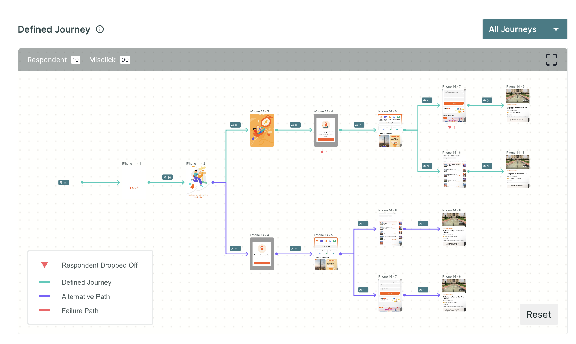
Below the summary dashboard of the task, you will find the user journey tree, which displays the path navigated by all the respondents while taking the test.
For the journeys, you will find the information by the coloured lines in the tree.
In the defined journey, the following information is shown:
- Green line: The respondents who have navigated through the defined path and landed on the goal screen.
- Purple Line: When the respondents have taken some path other than the defined path yet landed on the goal screen.
- Red Line: When travelling this path, the respondents have not reached the goal screen.
- Red down arrow 🔽: This icon displays the number of users who closed/skipped the journey after visiting a particular screen.
For the exploratory journey, there is no alternate path. The journey can be either a success or a failure.
Success: When the respondents can reach the goal screen.
Failure: When respondents do not reach the goal screen.
Insights from the User Journey
- Popular paths: By examining the user journey tree, you can identify the most common paths taken by respondents. This insight helps you understand the preferred navigation patterns and the pages or features that attract the most attention. You can leverage this information to optimize and enhance the user experience on these popular paths.
- Abandoned paths: The user journey tree can also reveal paths that are frequently abandoned or not followed by respondents. These abandoned paths may indicate where users encounter difficulties, confusion, or disinterest.
- Navigation patterns: Analyzing the user journey tree allows you to observe the navigation patterns of respondents. You can identify if users follow a linear path, explore different branches, or backtrack to previous pages. This insight helps you understand how users interact with your prototype and adapt the navigation flow accordingly to ensure a seamless and intuitive user experience.
- Bottlenecks or roadblocks: The user journey tree can highlight specific pages or interactions where users frequently get stuck or face challenges. These bottlenecks or roadblocks in the user journey can provide valuable insights into areas that may require improvements, such as unclear instructions, confusing interface elements, or complex tasks. By addressing these issues, you can smoothen the user journey and enhance usability.
- Deviations from expected paths: The user journey tree might reveal unexpected paths taken by respondents that differ from the intended user flow. These deviations can indicate opportunities to optimize the prototype by aligning user behaviour with the desired user journey. Understanding why users deviate from the expected paths can provide insights into their needs, preferences, and potential design or content improvements.
4. Graph metrics
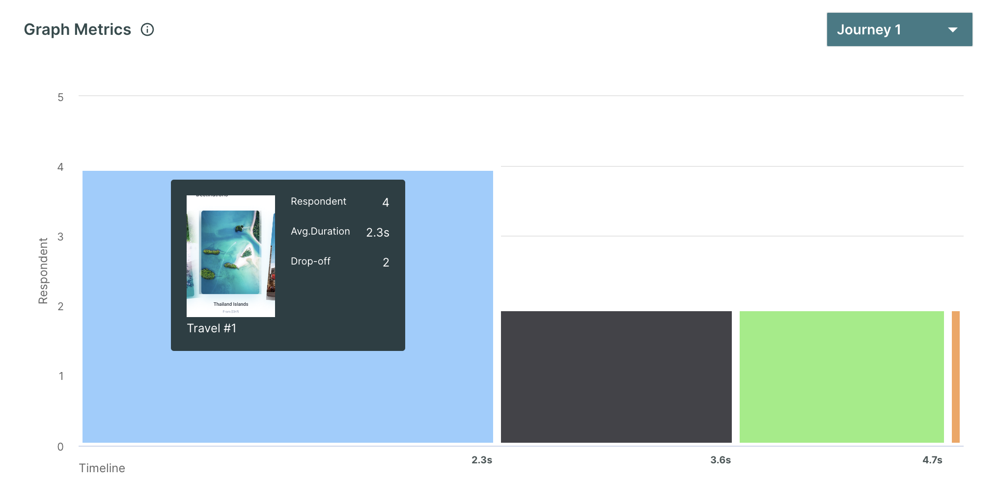
The performance metrics provide a clear picture of the average time spent on each page in the prototype. This information is presented alongside the total time taken to complete the task and the number of respondents who have visited each page. By mapping these metrics together, we gain insights into how users interact with each page and how it contributes to the overall task completion.
Insights from Performance metrics
- Column height: This indicates a significant drop in people's engagement with the corresponding page. It suggests that users are leaving or losing interest in that particular page. It could be a sign that the content or design of the page needs improvement to retain user attention.
- Column width: If any particular column is wider than the other columns, it suggests that respondents have spent a considerable amount of time on the page. It may indicate that the page is either providing valuable information or engaging the users in some way. However, it's important to note that spending too much time on a page also indicates confusion or difficulty in finding the desired information.
5. Performance Breakdown
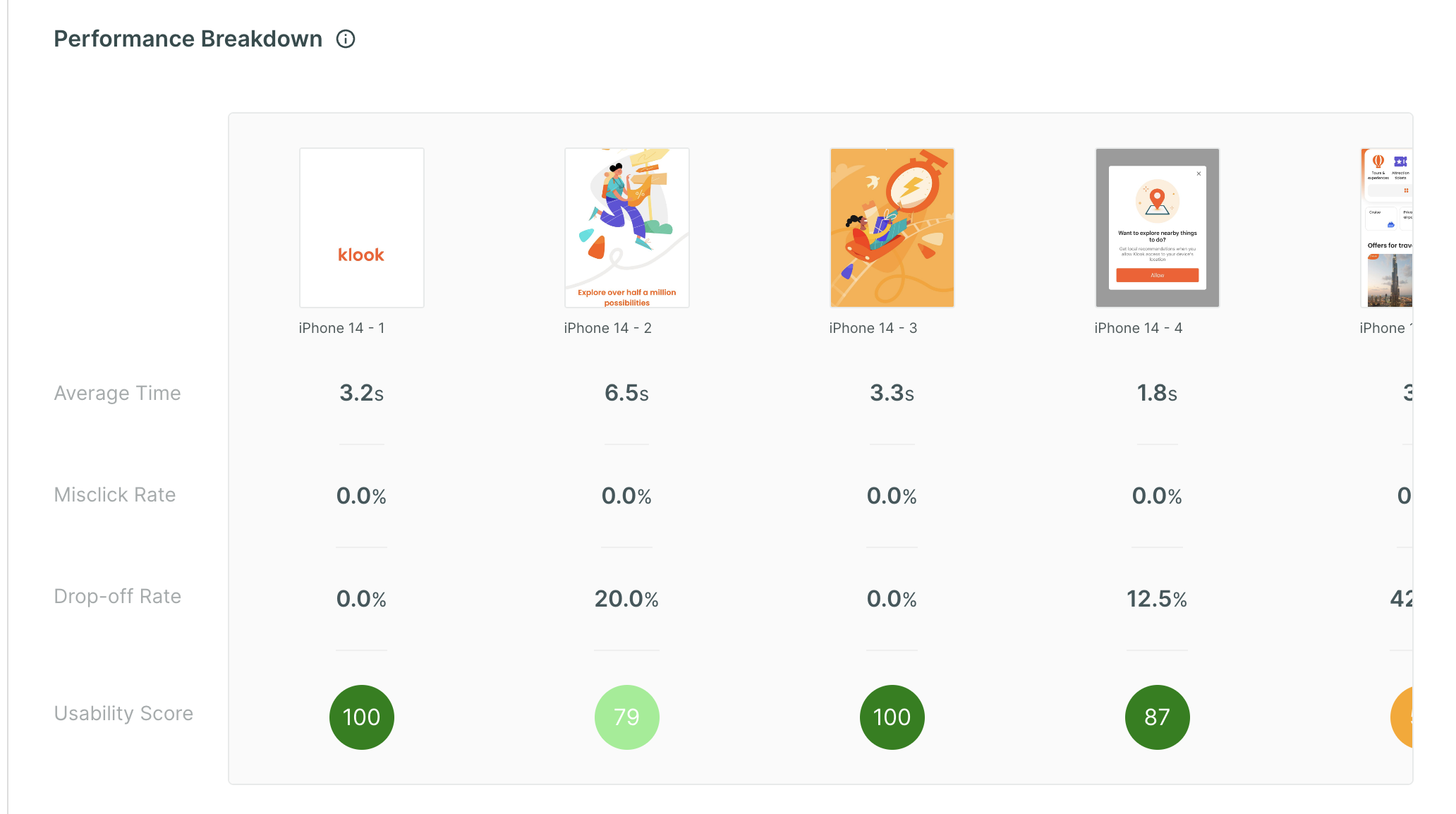
This chart showcases the comprehensive performance analysis of each page within the prototype. It presents valuable insights such as the average time spent by respondents on each page, the misclick rate, and the drop-off rate.
By harnessing these metrics, we derive a usability score for every page, offering users a clear understanding of how each page performed so that they can focus on areas that require improvement.
Usability Score = MAX(0,100 - (Drop Off) - (Misclick Rate *misclick weight) - (MIN(10,MAX(0,(Average duration in sec) - 5)/2))))
The Misclick weight equals 0.5 points for every misclick.
Insights from Performance Breakdown
- Identify high-performing pages: Pages with a shorter average time spent, lower misclick rate, and lower drop-off rate can be considered well-designed and well-performing. These pages likely provide intuitive interactions and a smooth user experience.
- Identify low-performing pages: Pages with a higher average time spent, higher misclick rate, and higher drop-off rate may require further investigation and improvement. These pages may have usability issues, unclear navigation, confusing elements, or uninteresting content.
- Prioritize improvements: By analyzing the metrics, you can prioritize your efforts based on the insights obtained. Focus on optimizing pages with high drop-off rates and high misclick rates to improve user experience, reduce abandonment, and increase engagement.
The page with a usability score below 80 calls for attention. The researchers can check eye tracking, mouse tracking and facial coding data and figure out if the behaviour is expected or an anomaly.
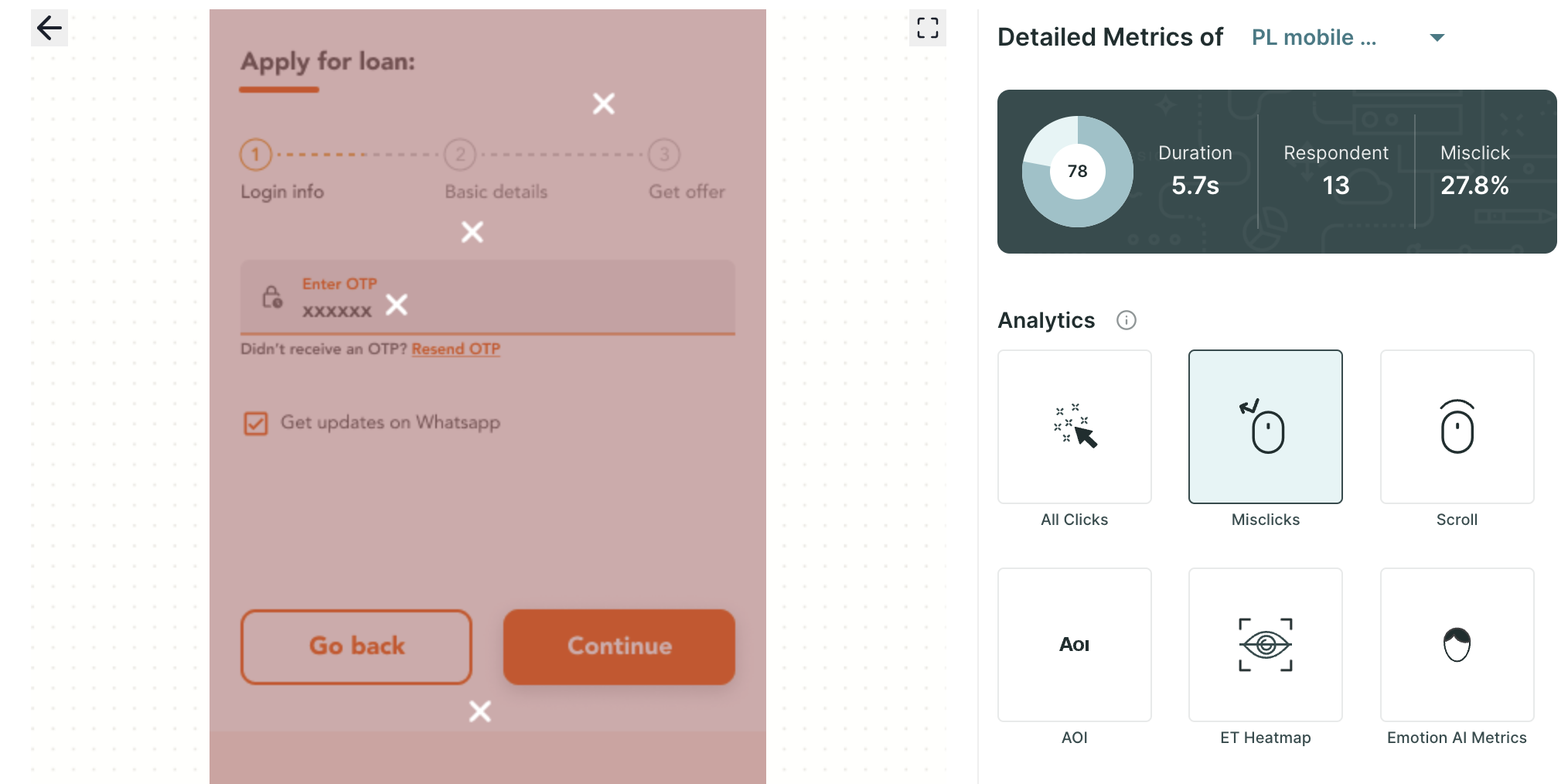
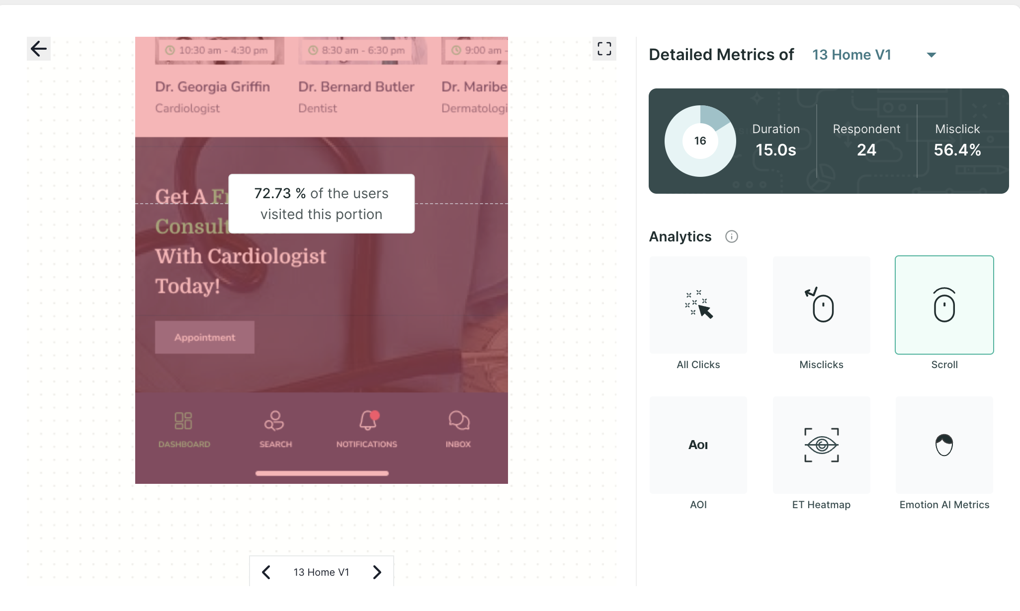
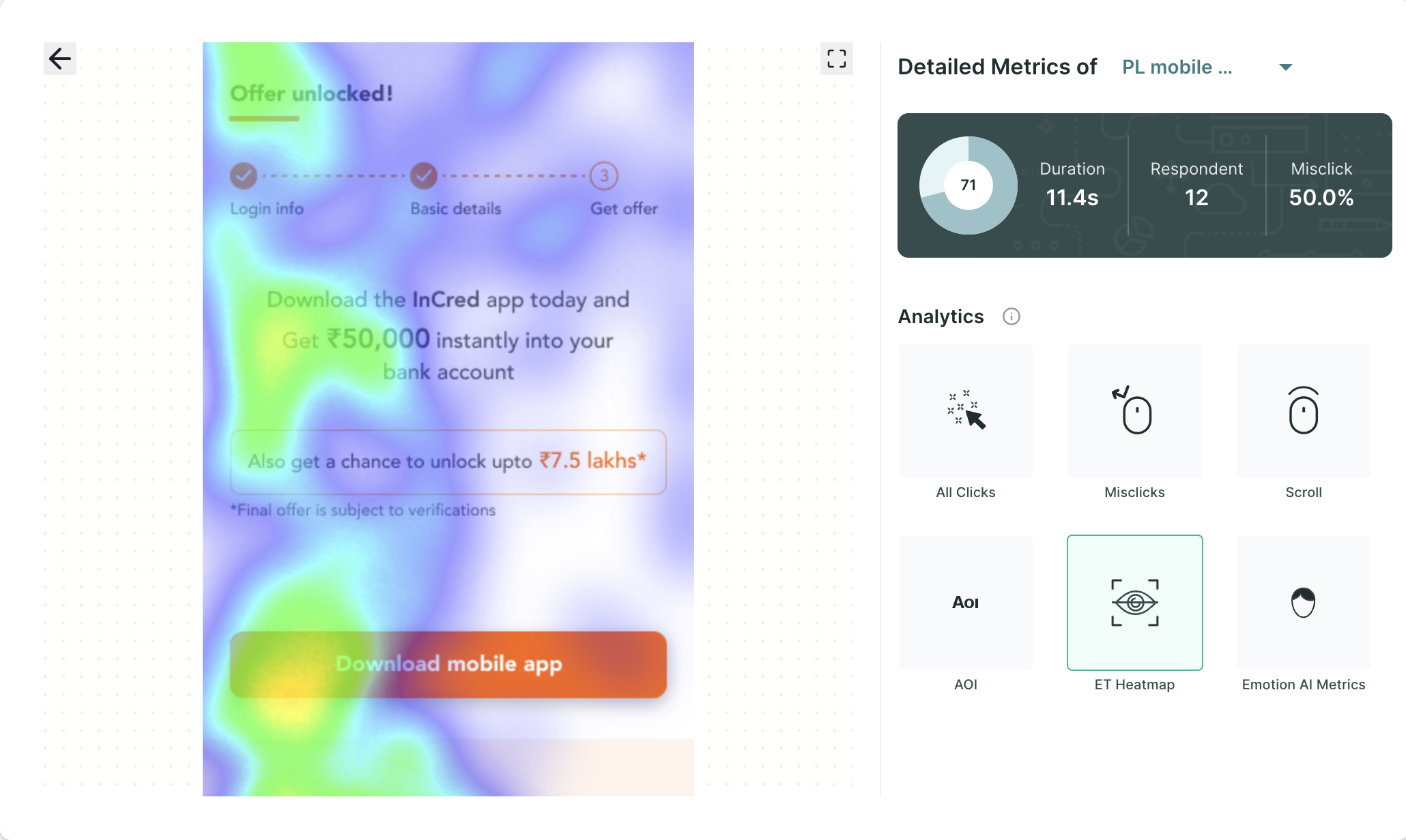
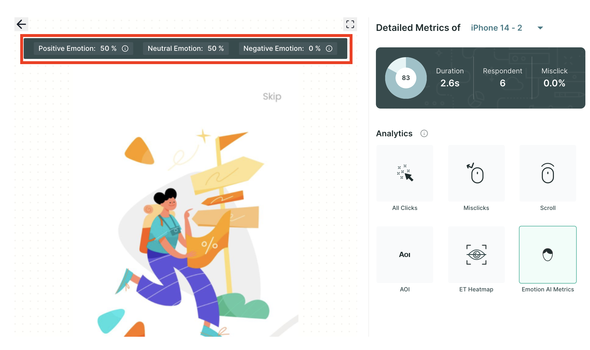
6. Emotion AI Metrics
When you click on any page using the performance metrics, you will be seamlessly transported to the detailed Metrics page, where you can delve into insights gathered from eye tracking, facial coding, and mouse clicks.
Here, you will discover information such as the average time spent on the page, the number of respondents who have visited the page, and intricate details regarding the misclick rate.
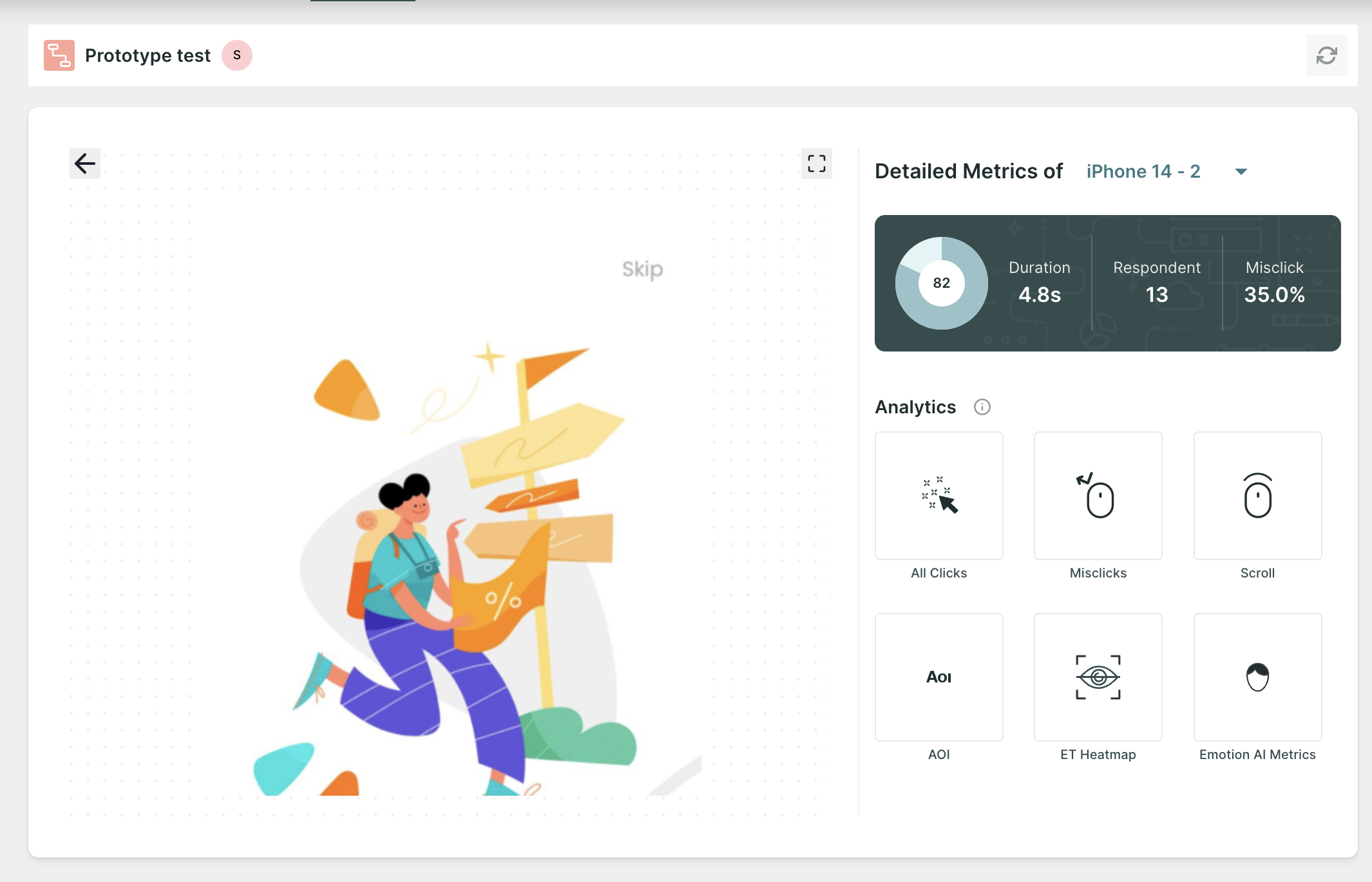
In the Analytics section, you'll have access to a wealth of metrics, including:
- All Clicks: This encompasses all clicks made within the prototype, offering a holistic view of user interaction.
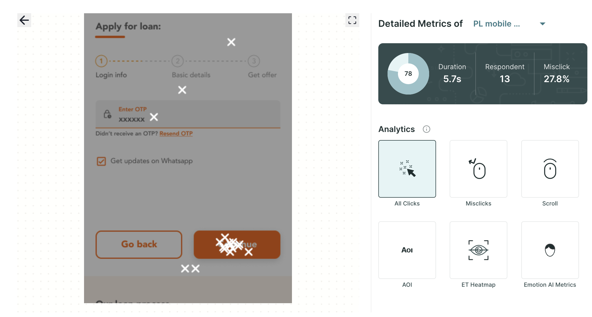
- Misclick: This specific metric isolates clicks made outside the designated clickable areas within the prototype, shedding light on user behaviour in unintended interactions.
- Mouse Scroll Data: This metric provides valuable insights into how users navigate a scrollable page by revealing the extent of the page they have visited. This metric helps us understand the user's engagement as they scroll through the content, offering valuable information about which areas of the page are being explored.
- AOI (Area of Interest): On the prototype page, you can create AOIs. Within AOIs, you can glean insights into metrics such as time spent, average time to first fixation, average fixation duration, the number of clicks, and the number of miss-clicks, providing a deeper understanding of user engagement.
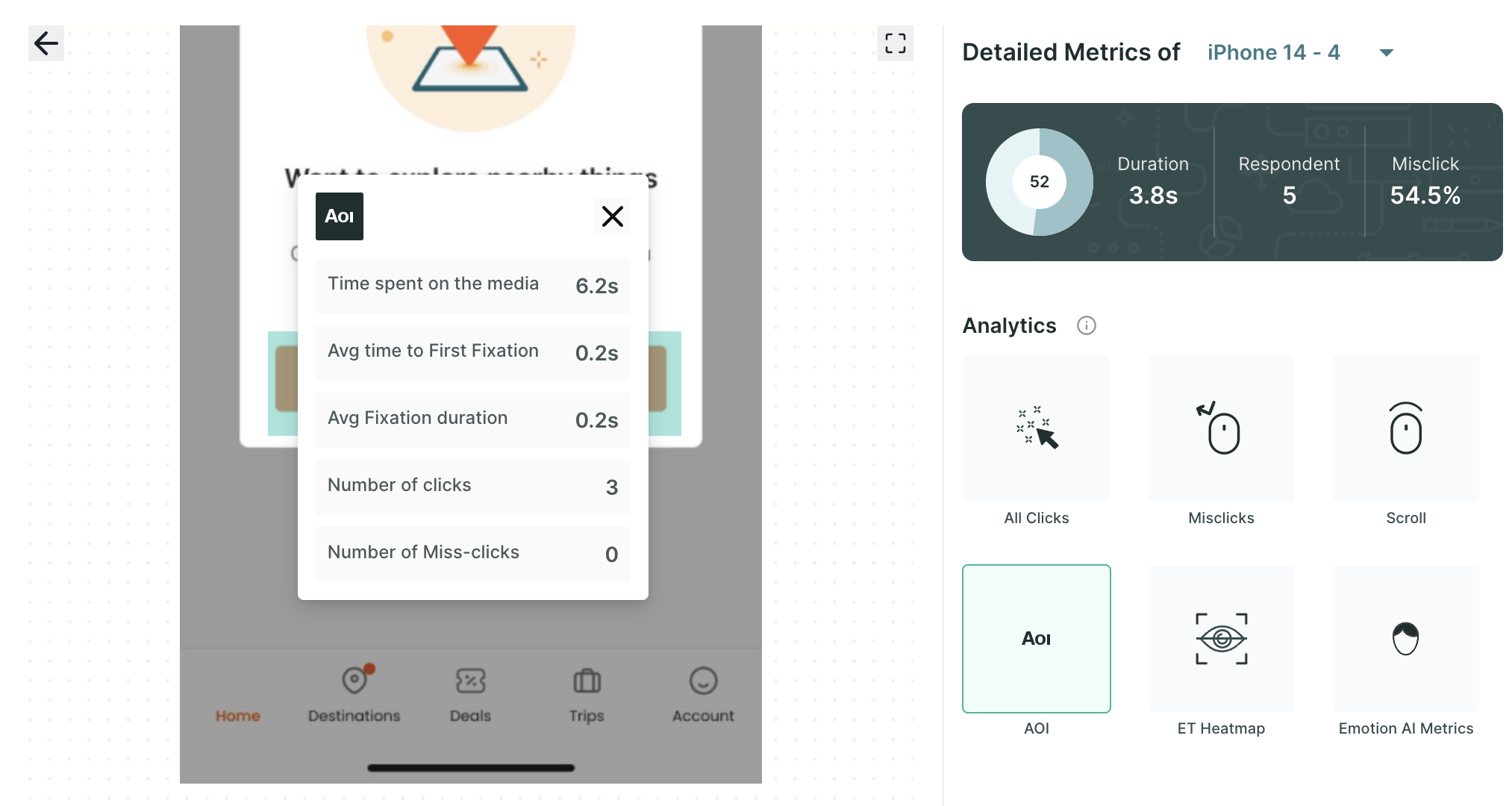
For example, an AOI could be used to track the time that users spend looking at a call to action button, or the number of times they click on a link. This information can be used to improve the usability of the website or app by making sure that the most important elements are easy to find and interact with.
- ET Heatmap: An eye-tracking heatmap is a visual representation of where people look on a page. It is created by tracking the eye movements of users as they interact with the prototype. The heatmap then shows the areas of the screen that received the most attention, with the hottest areas being those that were looked at the most.
- Emotion AI Metrics: Dive into the emotional resonance of your content with metrics that categorize user responses as neutral, positive, or negative, allowing you to gauge the emotional impact of your design or content.
By exploring these meticulously curated metrics, you can gain a comprehensive understanding of user engagement and behaviour, empowering you to make data-driven decisions to enhance your project's performance and user experience.
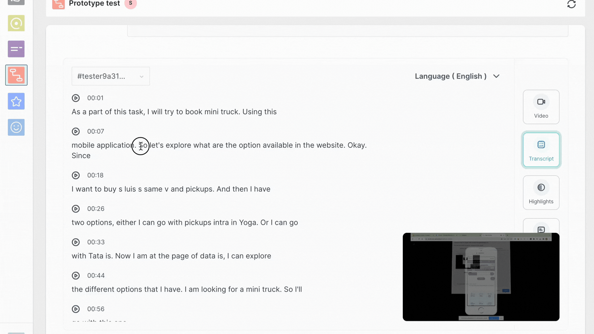
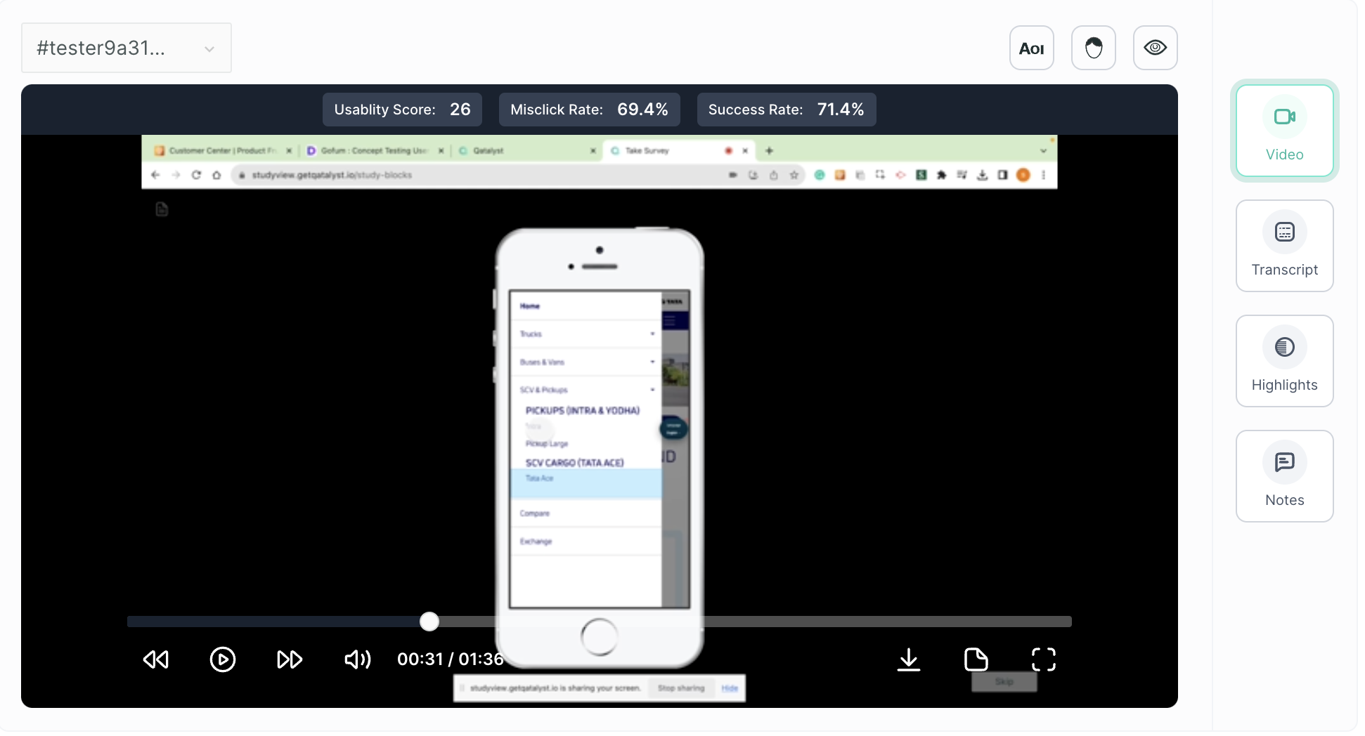
7. Screen Recording
Under this section, you will find the screen recordings of the session taking the test. You can use the top dropdown to select the testers.
Along with the video recording, you will get the following functionality:
- Eye Tracking Metrics: Shows where users look on the screen with a heatmap.
- Facial Coding Metrics: Tracks how users feel using facial expressions, displayed as positive and negative emotion charts.
- AOI (Area of Interest): Let you choose specific parts of the video to study closely.
- Transcript: Writes down everything users say in the video.
- Highlighting: Helps you point out important parts in the transcript.
- Notes: Allows you to jot down thoughts or comments at specific times in the video.
Highlight Creation