August 22nd , 2024
What's New?✨
1. Introducing Personalising brand logo💡
- Now you can customize the experience of clients by adding their brand logo to the left of the navigation bar and setting a favicon/ upload logo across the platform. This feature allows for personalised branding and enhances the brand's platform's visual identity.
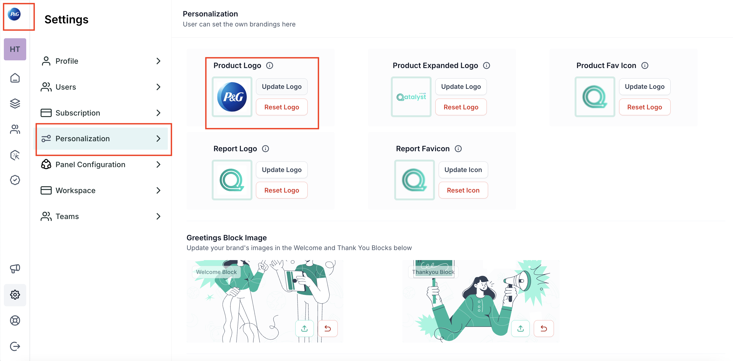
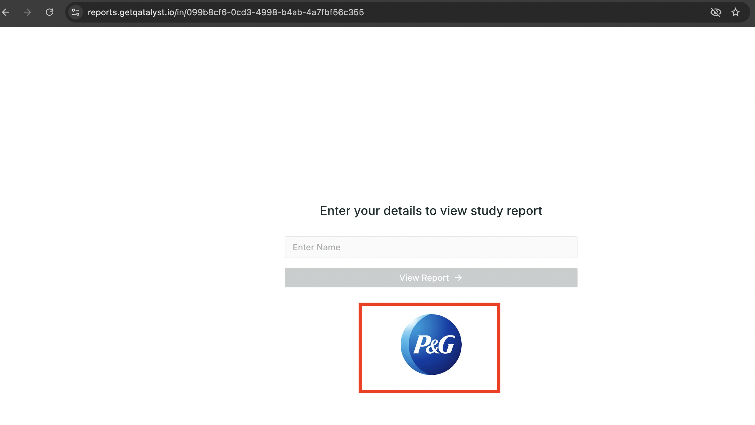
- Brands can now enhance their reports by adding their logo before sharing. This new feature allows for personalised branding on all shared reports. By incorporating your logo, reports will reflect brand’s identity. This tailored customisation helps recognisable presentation of your shared document
2. Introducing tester names in insights💡
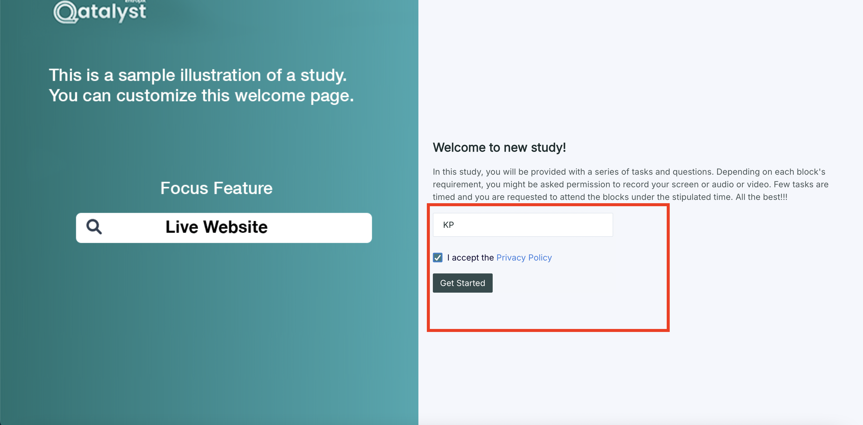
- Now researchers can collect and view tester names in the results, replacing random IDs. This enhancement allows for more meaningful identification of testers. Access to actual names improves data analysis and personalisation
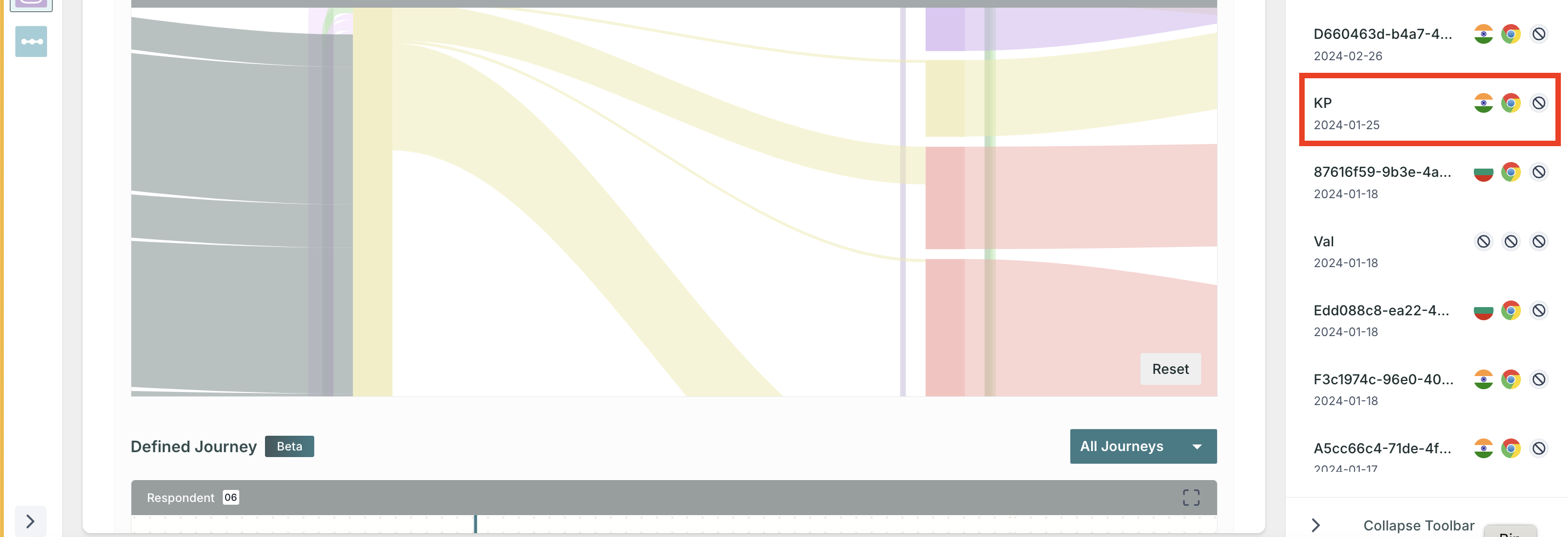
- Users can even see Tester names in the Sankey chart and use drop-downs to access videos of individual testers. This improvement provides clearer insights and easier navigation of test data. Enhance your analysis with more detailed and accessible information to streamline user experience
3. We are towards getting VAPT Certification!
We are thrilled to share that our platform is on going with VAPT (Vulnerability Assessment and Penetration Testing) certification. This certification will help us underscores our dedication to the highest standards of security and rigorous testing. With VAPT certification, our platform undergoes comprehensive vulnerability assessments and penetration tests to ensure its safety and reliability.
Enhancements🚀
Excited to announce the enhancement of the UI
- Top Bar Revamp: The Top Bar has been redesigned for a modern, streamlined look, enhancing overall navigation.
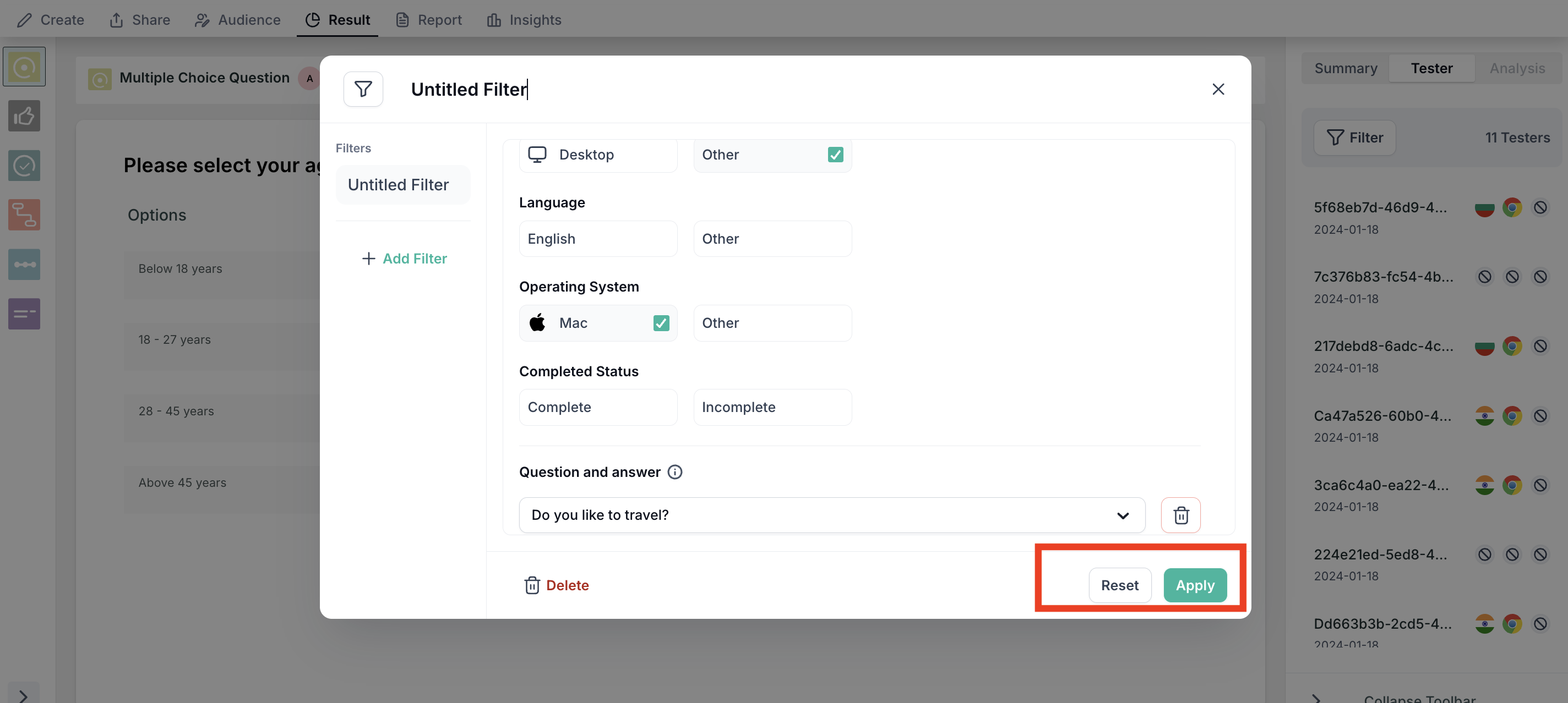
- Reset Button Disable: The reset button now properly disables after use, ensuring a smoother and more predictable user experience.
- Collaborator List Alignment: Alignment issues in the collaborator list have been fixed, providing a cleaner and more organised view.
- Add New Block Icon Update: The "Add New Block" icon has been updated in the expanded view for improved clarity and usability.
- Icon Consistency: Logic and property icons now have a standardised look for a cohesive and professional appearance.
- Study Template Button Color: The icon color of the study template button has been changed for better visibility and interaction.
- Spacing Adjustment: Spacing has been adjusted to maintain a 12px gap between icons and labels, enhancing readability and visual consistency.
These updates are designed to improve the overall user experience and ensure a more seamless interaction with our platform.
Bug Fixes🔧
- Fixed a bug for error image display when import of prototype fails.
- Fixed a bug for Co-pilot when any tester-Id drops off yet the query should be able to work
- Fixed a bug where screen recording data was not being uploaded to the S3 bucket when testing through Safari on a live website. Now, data is captured accurately
- Fixed a bug when a user selects the Likert scale option and skips the block, the data was not captured, causing the test to get stuck. Now, clicking the skip block after selecting a Likert option ensures that data is successfully uploaded and the test proceeds without any issues.
- Fixed a bug for Import Failures of Prototype, now users will be able to see notification display and specific toaster messages for failed import. These notifications will offer detailed insights into the issue and guidance on how to resolve it, making the import process more user-friendly and transparent.
- Fixed a bug for users to navigate seamlessly back and forth to different blocks. Earlier "something went wrong "issue was displayed.
- Fixed an issue for the filter section on block properties. When applied filters & users click on the tester tab, the filter needs to be reapplied each time they navigate away and return.
- Fixed a bug for UI alignment when users click to invite collaborators under the results tab
- Fixed a bug for the Co-pilot query, the arrow button to submit a query now functions correctly when a user selects a study from the list by clicking on it
- Fixed a bug for alignment of the Copilot text animation, even when the browser window size is smaller
