
Mobile App Testing Analytics
Mobile application testing involves assessing and evaluating a mobile application's usability, functionality, design, and overall user experience. This process aims to understand how users interact with the app, identify potential issues or pain points, and gather insights to enhance the app's usability and user satisfaction.
In this article, we will provide you insights on different metrics you will get for mobile app testing in Qatalyst and their definitions.
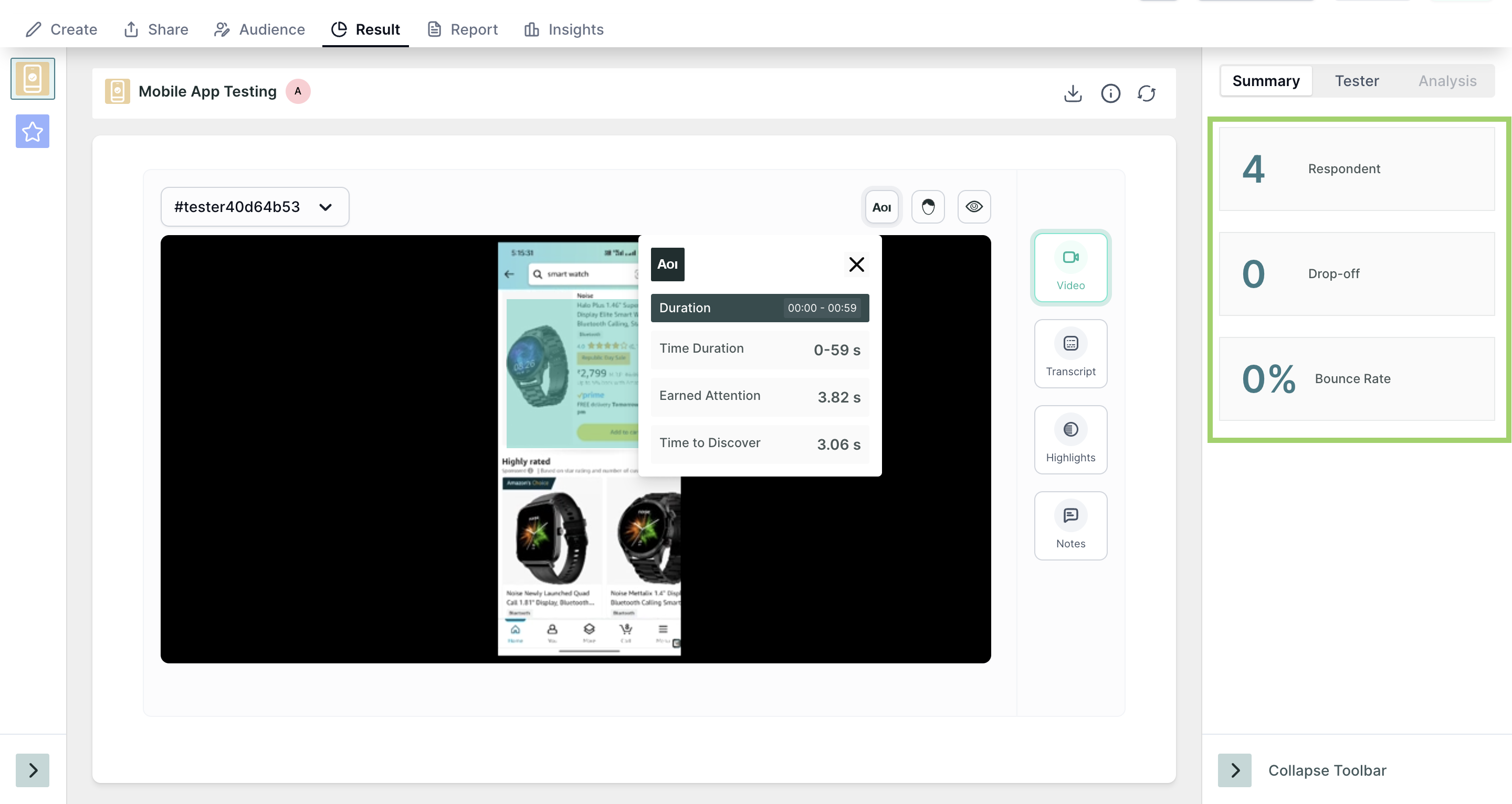
Once the respondents have taken the test, you will be able to see the analytics in the result section. In the result view, you will find the session recording, transcript, and other insights.
In the summary section, you will find the following information:
- Respondents: Number of people who initiated the test block.
- Drop-off: Number of people who have not moved on to the next block.
- Bounce Rate: ((Dropoff + Skip)/ Number of Responses)*100 . (In Percentage)
The result of the mobile app testing consists of following 4 sections:
- Video
- Transcript
- Highlights
- Notes
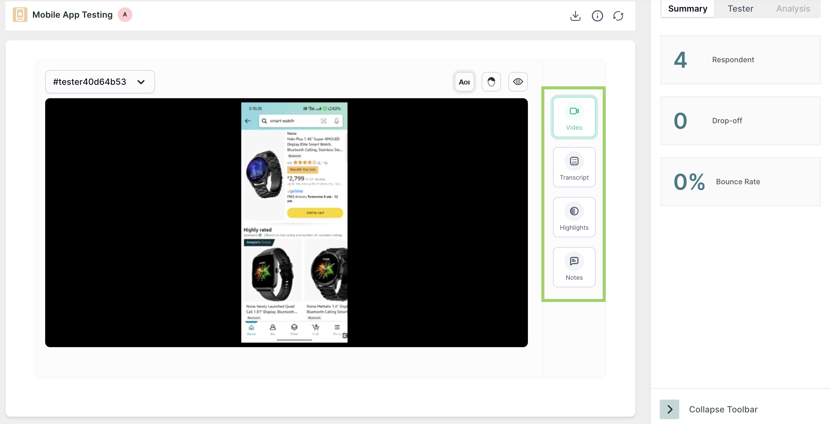
Video
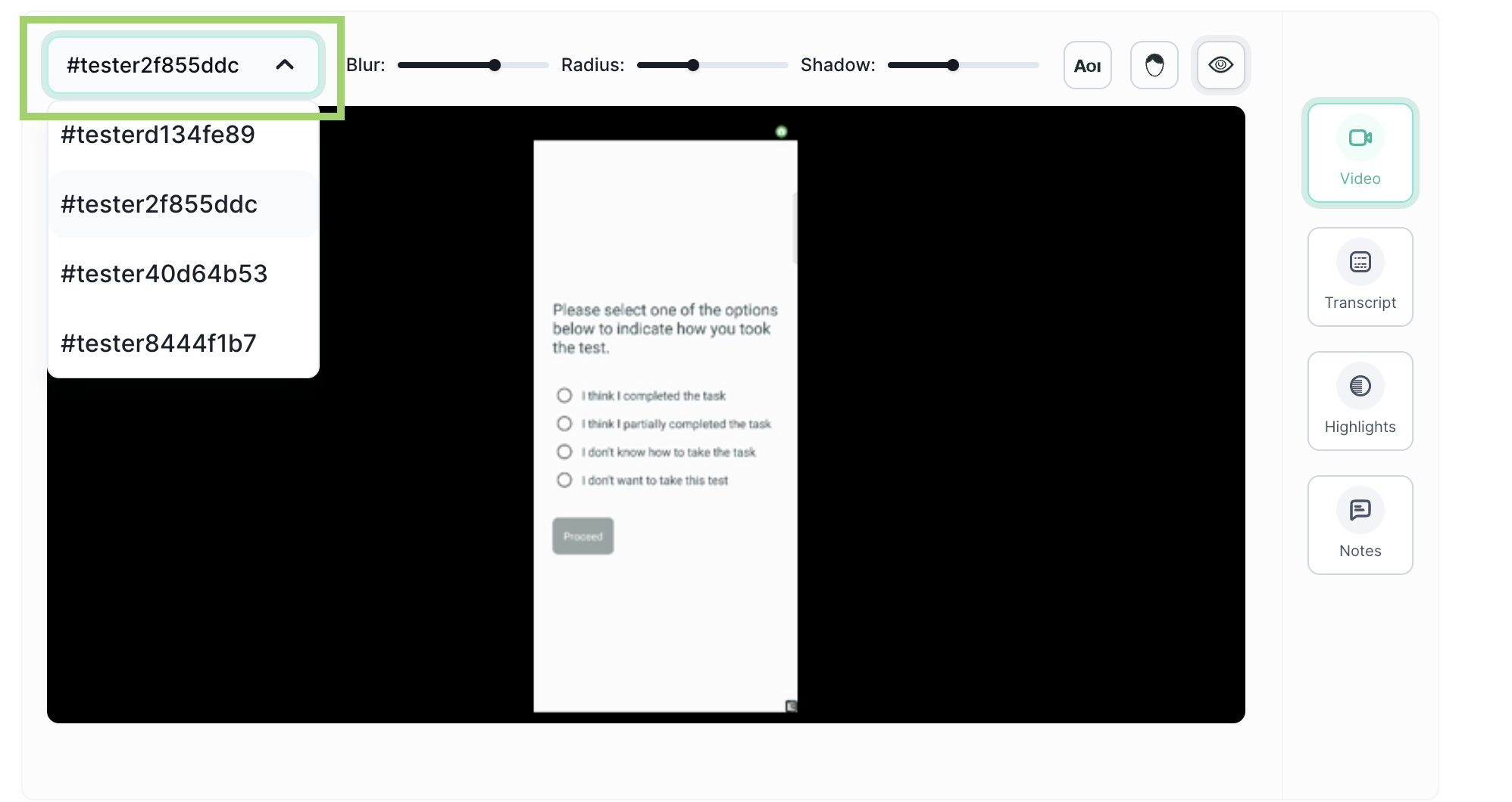
In the video section, you will find the screen recording of the test for every respondent, use the dropdown at the top of the screen to select the respondent.
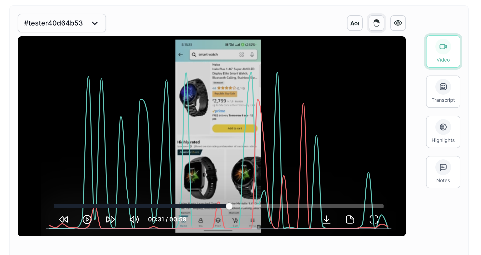
If you have enabled eye tracking and facial coding in the task, you will get insights for both, and they can be viewed by clicking the icons respectively.
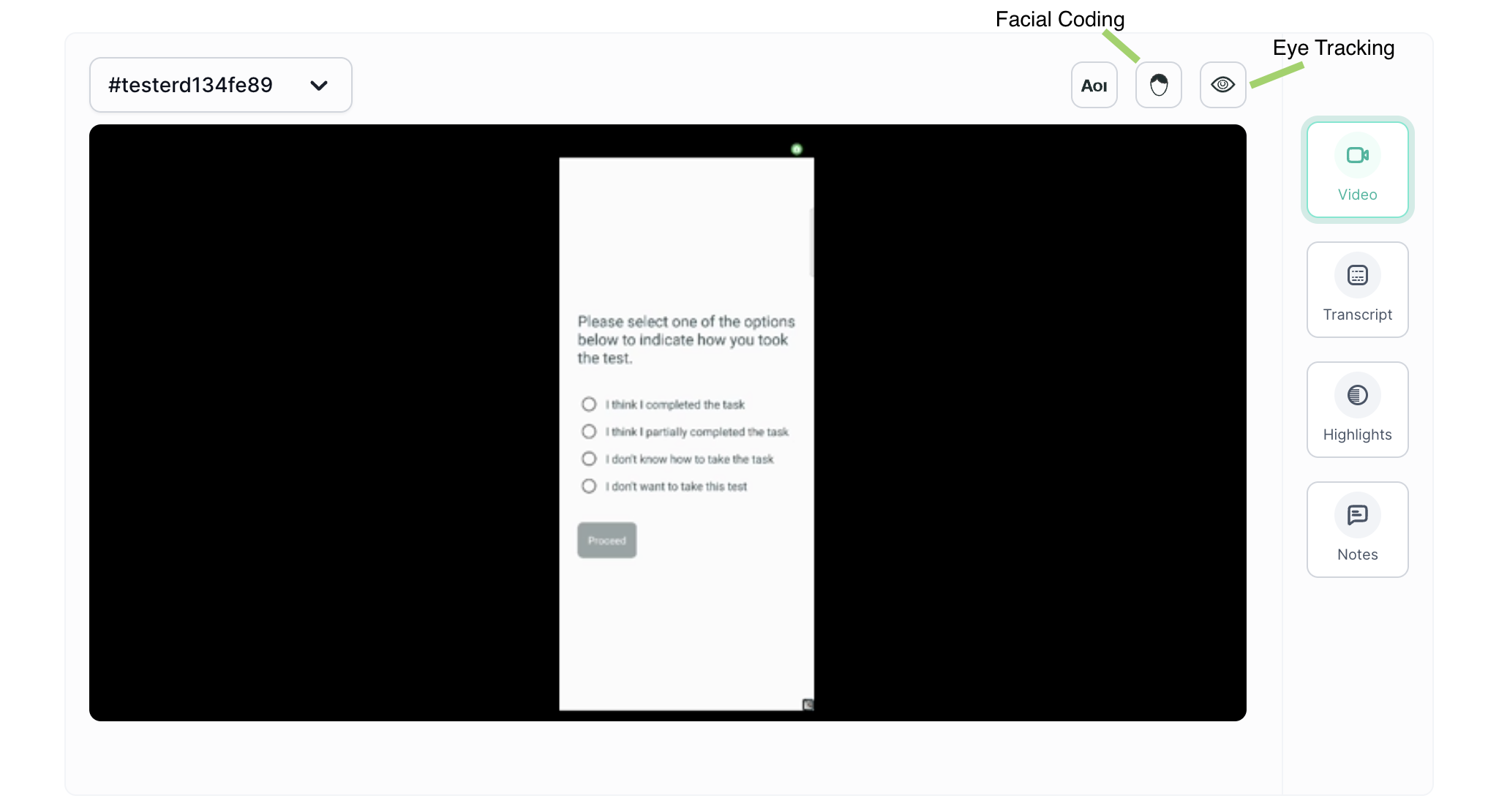
- ET Heatmap: An eye-tracking heatmap is a visual representation of where people look on a page. It is created by tracking the eye movements of users as they interact with the prototype. The heatmap then shows the areas of the screen that received the most attention, with the hottest areas being those that were looked at the most.
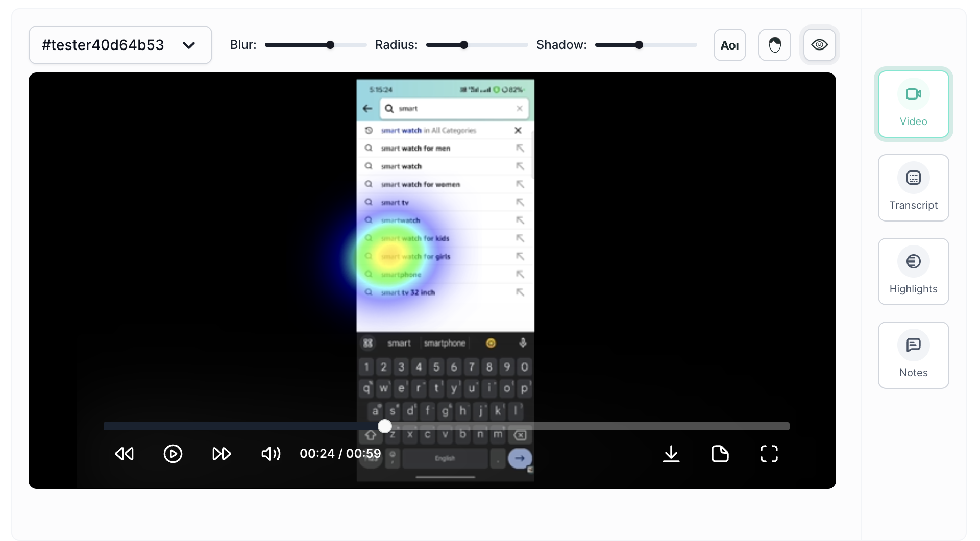
You can adjust the parameters like blur, radius and shadow per your preference.
Emotion AI Metrics: Dive into the emotional resonance of your content with metrics that categorize user responses as positive and negative, allowing you to gauge the emotional impact of your app.
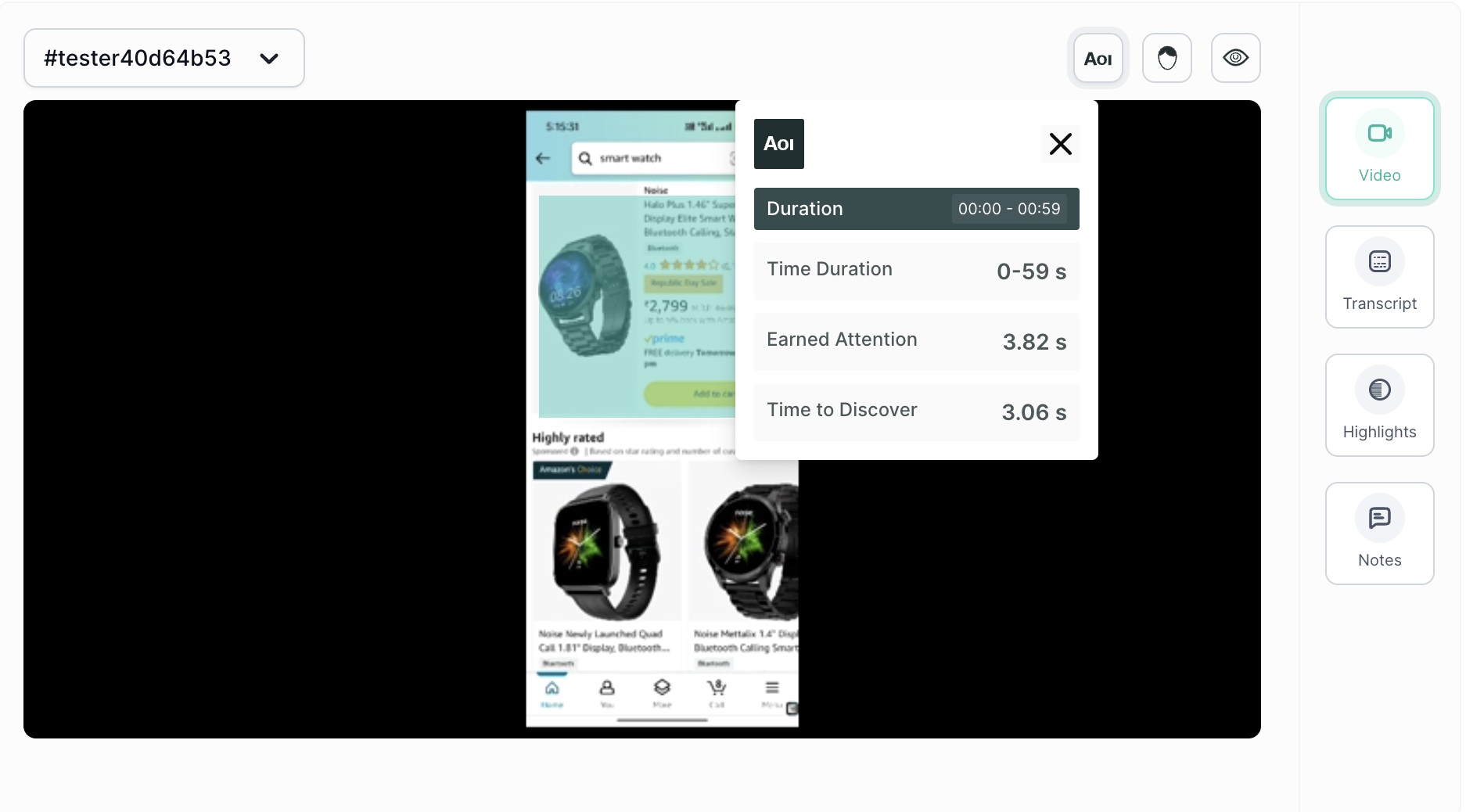
Area of Interest(AOI): AOI is an extension to the eye tracking metrics. It allows you to analyse the performance of particular elements on the screen. Once you select the AOI option, just draw a box over the element, and then a pop-up will appear on the screen for time selection, you can select the time frame, and insights will appear in a few seconds.
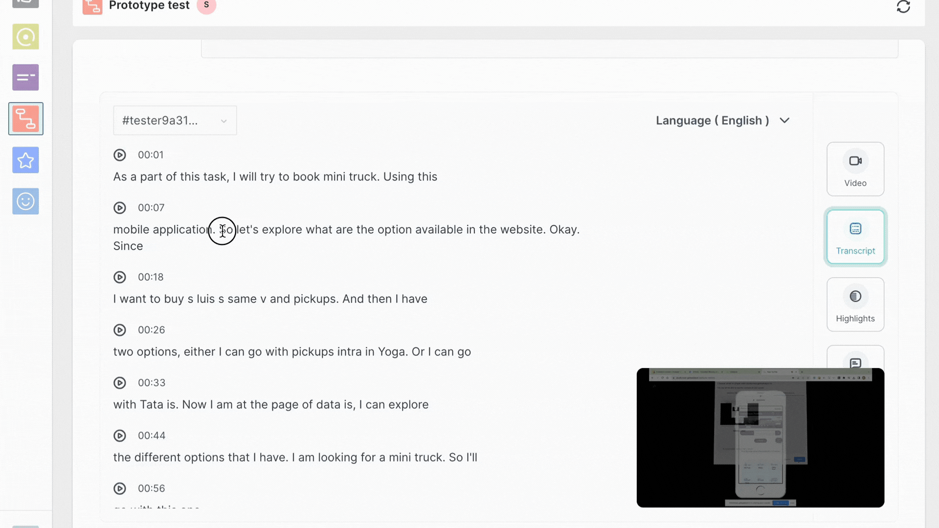
Transcript
The next section is Transcript. If the recording has audio, you will find the auto-generated transcript for it, where you can create tags and highlight the important parts.
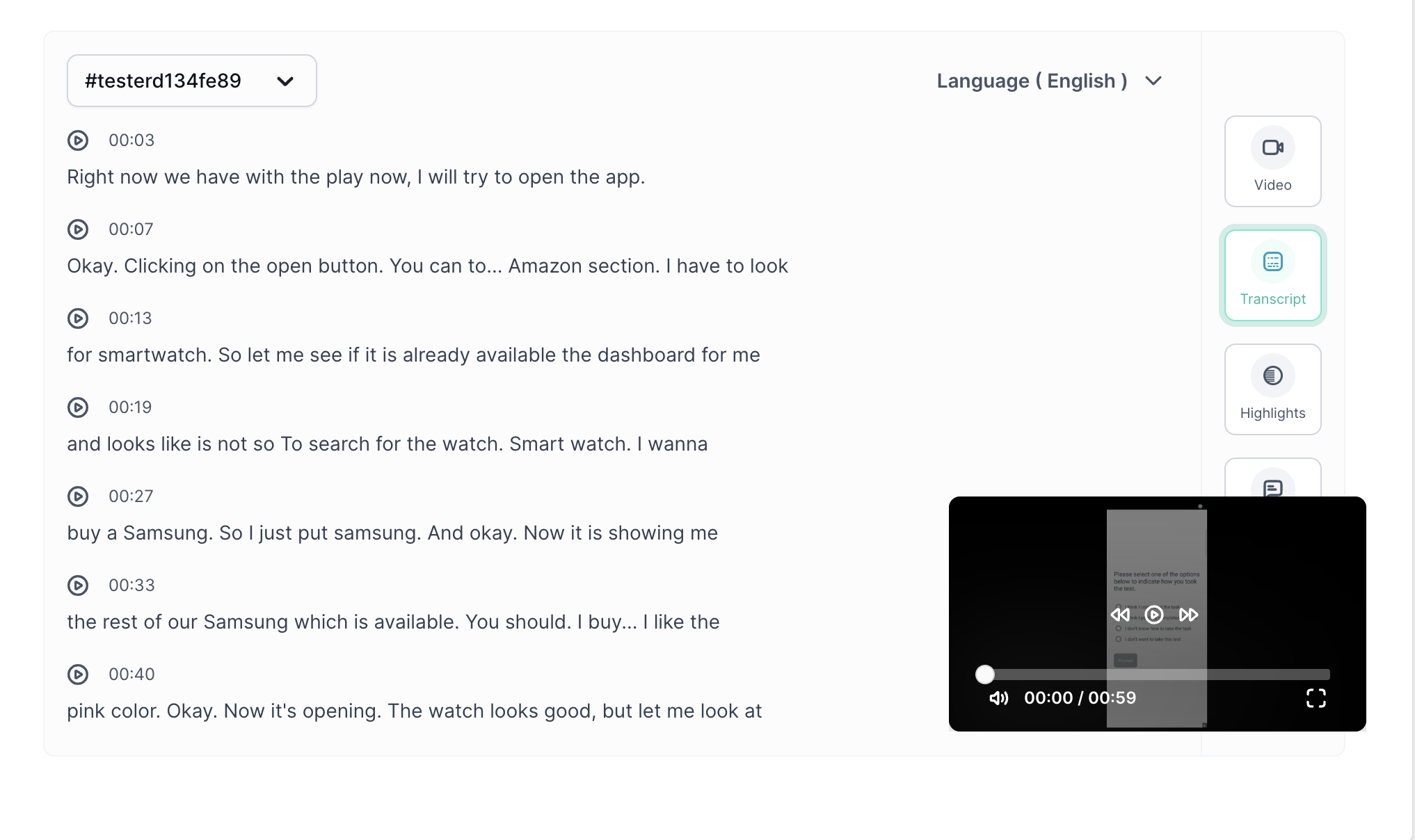
For creating tags, select the text, and a prompt will appear where you can give the title of the highlight, which is " Tag".
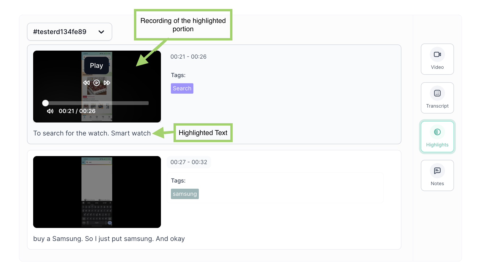
Highlight
All the highlights created on the transcript will appear in this section. You can also play the specific video portion.
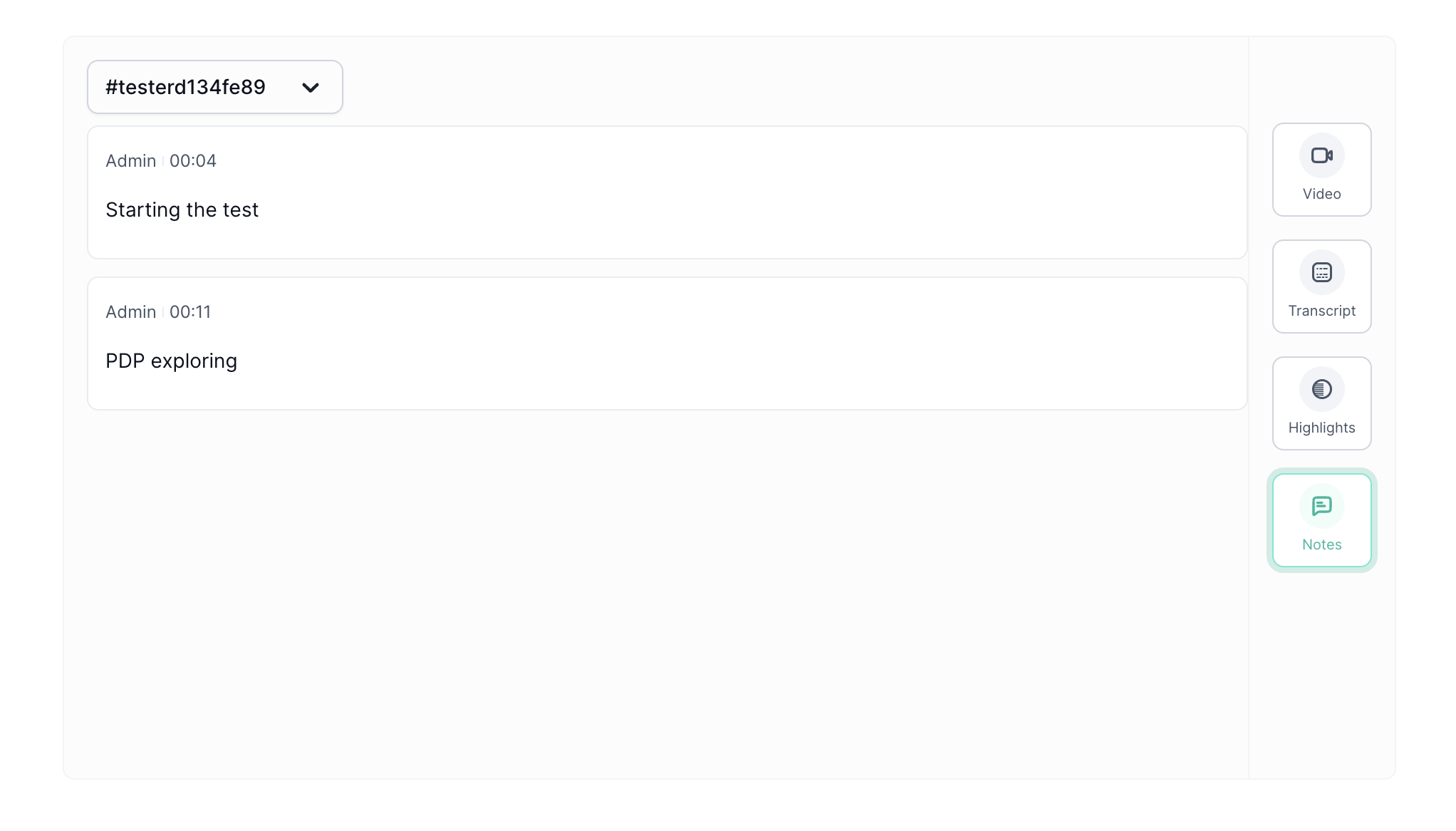
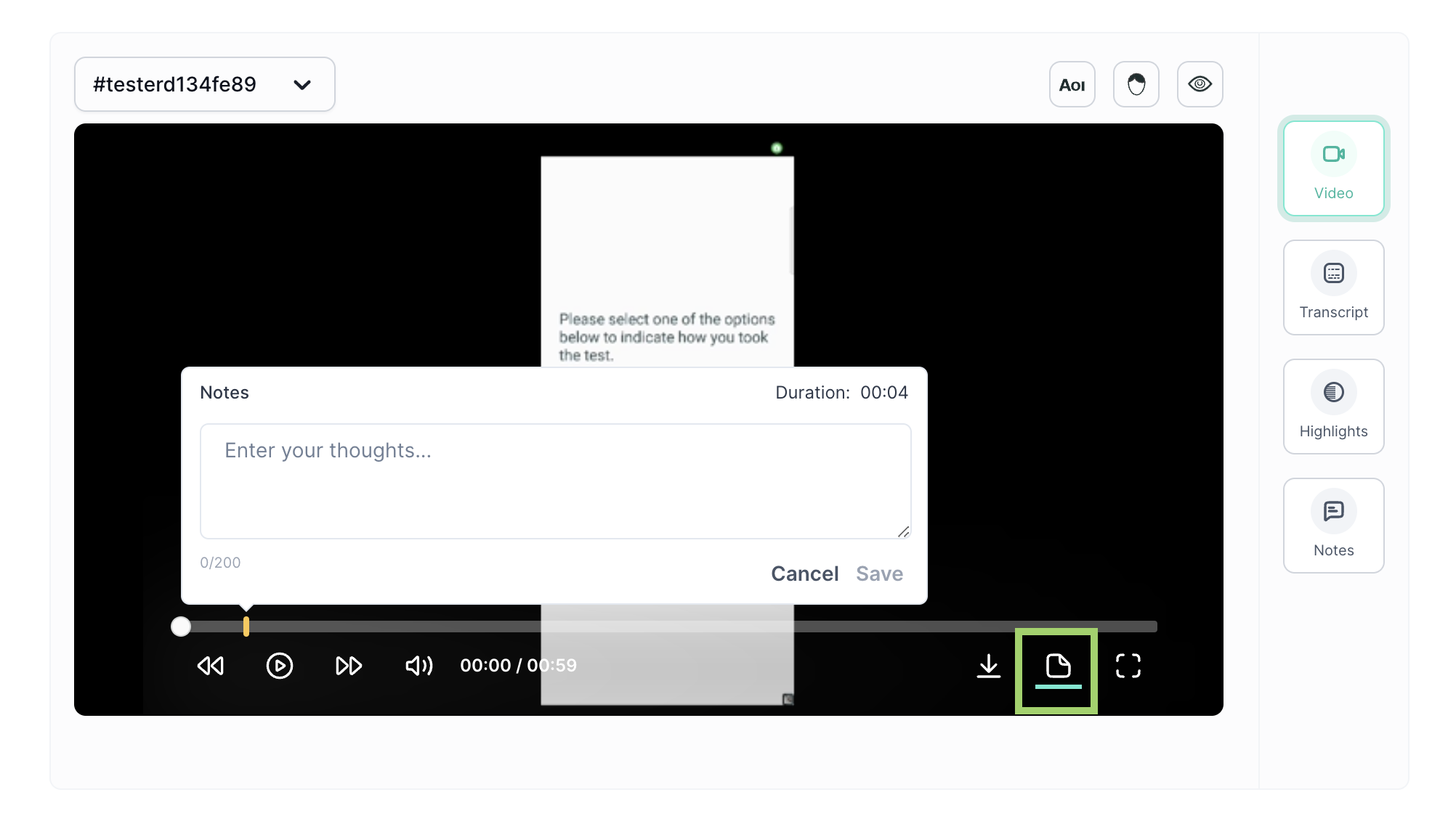
Notes
This section displays the notes created on the recorded video.
How to create notes?
- On the recorded video, click on the notes.
- Click on the specific time from the video player seeker where you want add note
- A prompt will appear, add the notes.
User Path Visualizer
User Path Visualizer provides an insightful representation of user journeys via the Sankey chart. This visualizer presents the paths taken by users through the website, offering a comprehensive view of the navigation patterns.
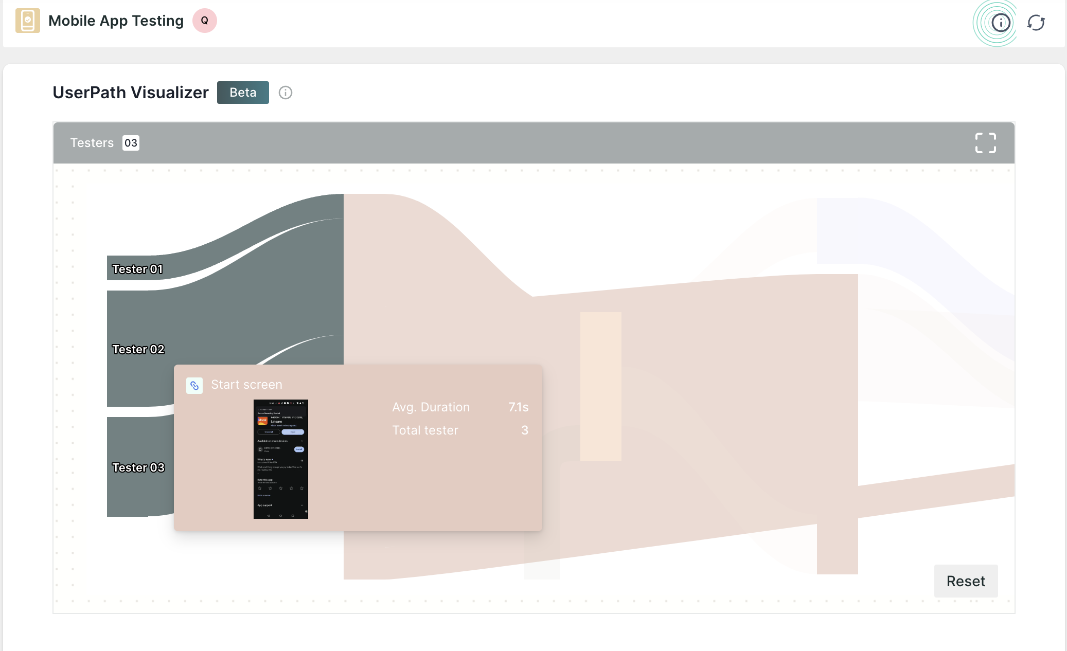
Additionally, it encapsulates various essential details such as the time users spent on each page, the number of users who visited specific pages, and the transitions between these pages.
User Journey Tree
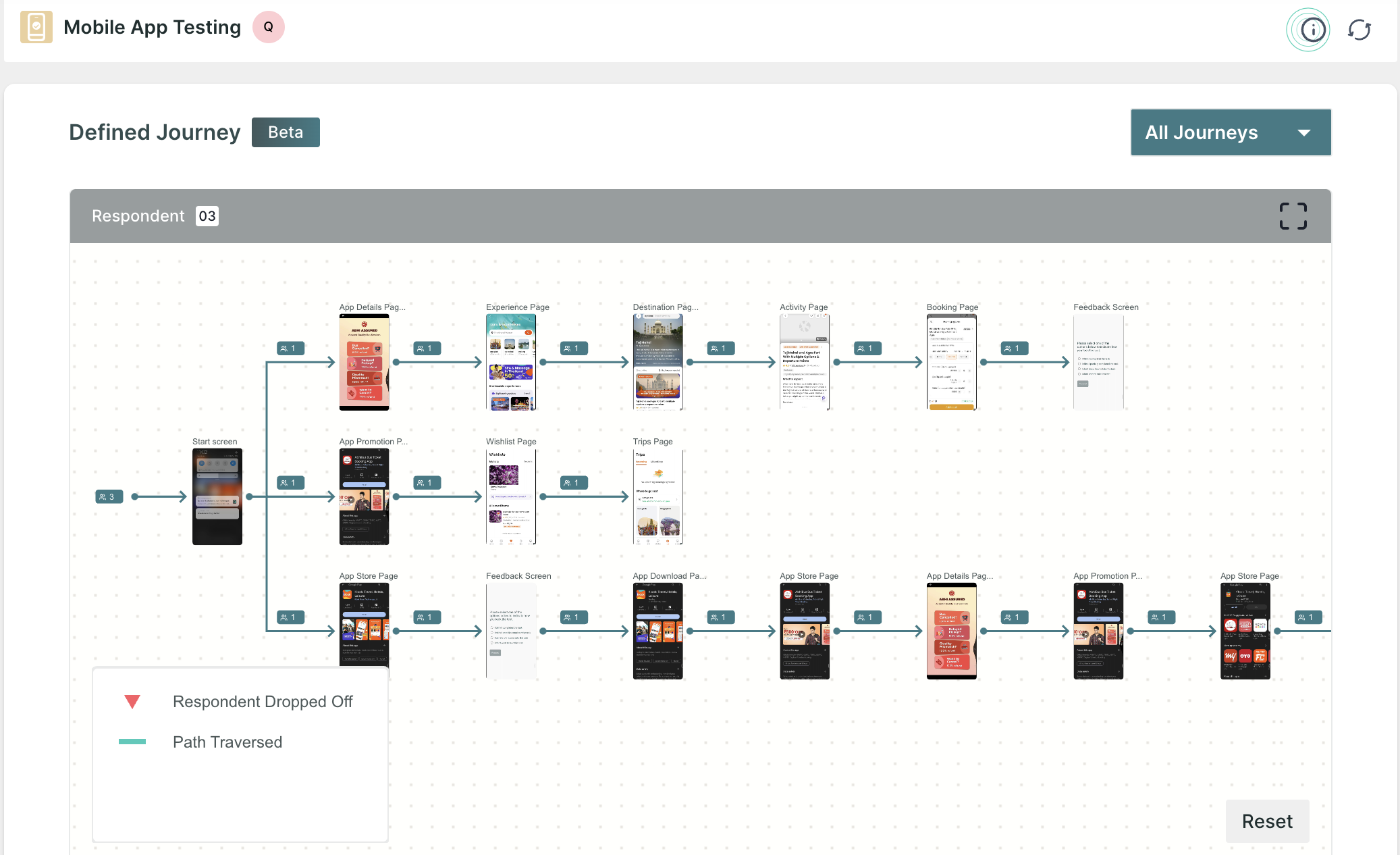
Below the summary dashboard of the task, you will find the user journey tree, which displays the path navigated by all the respondents while taking the test.
For the journeys, you will find the information by the lines and the name of each page in the tree.
The following information is shown:
- Green line: The path navigated by the respondents to complete the task.
- Red down arrow 🔽: This icon displays the number of users who closed/skipped the journey after visiting a particular screen.
Performance Breakdown
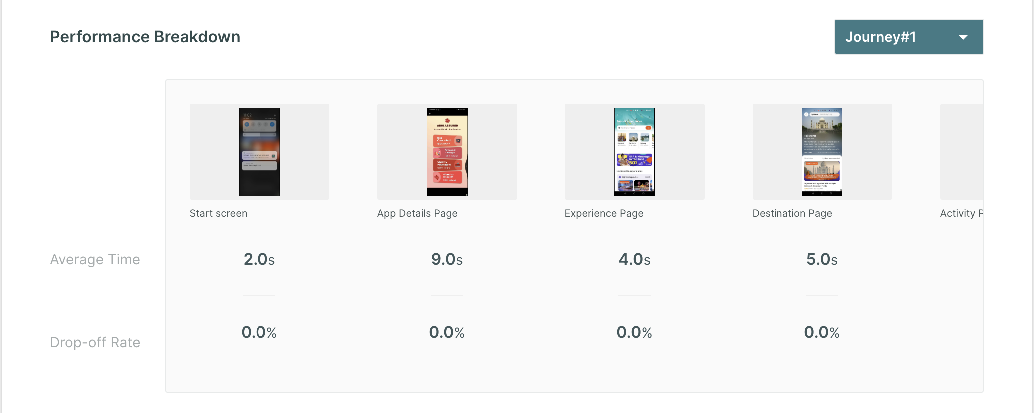
This chart showcases the comprehensive performance analysis of each page the respondents have navigated. It presents valuable insights such as the average time spent by respondents on each page, and the drop-off rate.